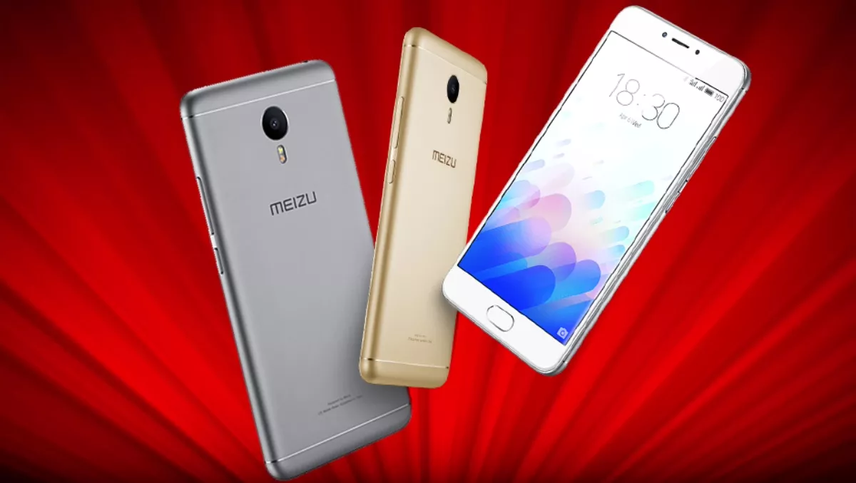
Hands-on review: Meizu M3 Note - bang for buck value
Not so long ago budget smartphones translated into dinky specs in janky Tupperware chassis. Lousy battery life, pokey processors and low-fi screens were the lot of budget smartphone buyers.
A lot has changed recently. Chinese smartphone makers have stepped up to the plate. They're selling affordable smartphones, often with well designed hardware and decent specs. These are more often than not sleek phones, with not so much Tupperware but lots of alloy and glass.
Meizu, Xiaomi, Oppo and Huawei have all led the charge. $400-$500 can now buy you a decent handset that'll give their big brand counterparts a serious run for their money. It takes a pretty decent device to compete at the budget end of the market, and Meizu's M3 Note - now selling through PB Tech offers some serious bang for buck value that belies its budget status.
Look and Feel
Perhaps the most striking thing about the Meizu M3 is how iPhone-like it is. It mightn't be the most original looking phone, but it looks good and has a premium feel in the hand.
Design-wise, the Meizu M3 is pretty standard. On its front it sports a physical home button that does double duty as a fingerprint sensor. It has camera/ambient light sensors on either side of the top screen bezel. On its rear, the Meizu sports a camera and flash. Power and volume buttons are on its left, with the dual SIM/MicroSD card slot tray on its right hand side.
The Meizu runs Android, customised with its in house developed Flyme user interface. There is no app drawer – everything is on the M3's home screens. In short, it looks and feels IOS like. This could see the Meizu being ideal for an iPhone user wanting to give the little green droid a spin.
Usability
While Android purists may lust after the stock Nexus's android launcher, they can download one such as the Google Now launcher. It'd be a real shame if they did though as the Flyme UI isn't half bad. It has a bunch of apps that proved to be pretty usable. My favourite was the "Toolbox" app. It has a flashlight, compass, digital spirit level and ruler. My initial impressions of it being bloatware faded as I found myself using the flashlight while walking the dogs.
Like a lot of other Chinese Android interfaces, Flyme is also customisable thanks to a Theme app, offering several tonnes of themes.
About the only real negative I found was that the mail app refused to play nice with Gmail. Another drawback is that the M3 runs Android 5.1 with no updater option that I could find. From a security standpoint, this is a concern.
Navigating the M3's interface proved confusing. The lack of a back and apps buttons left me flummoxed. Doing some RTFM (reading the freaking manual) revealed some of the M3's clever home button tricks. Pressing it takes you to the (surprise, surprise!) home screen. Tapping it works like a back button while Swiping up from the bottom of the screen opens up a list of recent apps. It is dead easy once you get it, but I did scratch my head for more than a few minutes.
The home button also doubles as a fingerprint sensor. 9 times out of 10 it detected my dabs. When it struggled, I just re-tried and it worked fine.
The M3's 5.5" 1080 IPS LCD looks great. It is bright enough to give it tanning studio status. Colours were so vivid that I first thought it was an AMOLED display. Viewing angles are also good. Most budget smartphones cut corners with displays, but Meizu seem to have gone the other way. Considering its sticker price, the M3's screen is on par with a lot of more expensive flagship phones.
Under the hood
The M3 Note comes with either 2GB of RAM and 16GB of storage, or with 32GB of Storage and 3GB of RAM. Powered by a MediaTek Helio P10 chipset, it sports a quad-core 1.8GHz Cortex-A53 CPU for battery intensive power user tasks and a quad-core 1.0GHz Cortex-A53 CPU for lighter and more battery friendly chores. There's also a Mali-T860MP2 GPU.
MediaTek silicon isn't the worlds fastest. It'll play basic games, but power users used to having dozens of CPU intensive apps running may find it limiting. In reality, this isn't a silly move by Meizu.
With a chunky 4,100mAh battery, the M3 Note gets though a day of normal use. Two days of light use and many days on standby were the norm.
If like most people you use your phone for calling, Facebooking and texting plus email and a bit of light surfing, the M3 is more than up to the job. For these users it'll out perform a lot of other handsets for battery life.
Its camera is a 13MP affair, lacking optical image stabilisation. This said, it does have phase detection autofocus and a bunch of nifty shooting modes. The photos it shot were passable for casual use, but pixel noise was noticeable. Autofocus also struggled sometimes. Low light shooting also produced noisy and washed out images.
By dumping Auto mode and using its comprehensive manual settings, things improve quite a bit. But using manual mode involves a fair bit of shagging about.
Verdict
There's a lot to like with Meizu's M3 Note. It looks great. Its battery life is brilliant and its sticker price is a wallet pleasing $329 for the 32GB version.
It isn't perfect. Smartphones and mobile devices are always a trade-off between performance and price plus quality.
While you can get other more powerful smartphones with better cameras, the pickings are slim for 32GB smartphones at the $330 mark. If you are on a budget and want plenty of storage plus killer battery life, the Meizu M3 Note is a solid choice.

