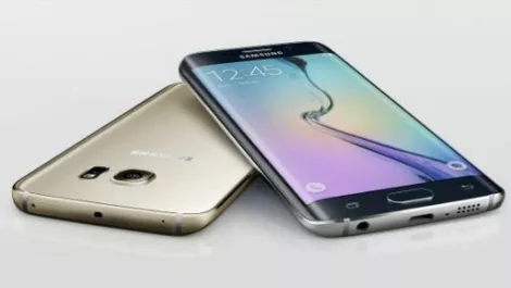
Hands-on review Samsung S6 Edge+: Yes size DOES matter
What a difference 12 months can make. A year ago, reviewers were bemoaning the construction of the Galaxy S5. Most agreed the S5 was solid and well featured, but few felt Samsung's choice of Tupperware did them any favours.
Since then, Samsung has launched the S6 Edge+, a super-size version of their successful S6 Edge smartphone. There's hardly any plastic anywhere.
Look and feel
Perhaps the most noticeable aspect of the S6 Edge+ is how solid it feels. Dispensing with Tupperware and moving to an all-metal and glass design gives the Edge+ a decidedly premium feel. In the hand it feels more like a Mount Blanc pen or a Swiss watch.
Looks-wise, it really is an upsized S6 with a bigger chassis, a larger display and a more capacious battery. The curved edges of the display are still there and bring the same nifty tricks to the table.
All told, the S6 Edge+ is definitely an attractive phone. The review unit I tested was decked out in a muted champagne gold finish. While champagne gold is the new white, some would say that it lends things a hint of sophistication, others may find it garish. Me, I liked it.
Under the hood
There's plenty of muscle crammed into its petite chassis. A Samsung Exynos chipset powers a Quad-core 1.5 GHz Cortex-A53 and a Quad-core 2.1 GHz Cortex-A57.
This processing grunt is complimented by a generous 4GB of RAM, which means the Edge+ can handle demanding apps and barely break a sweat.
Its rear 16-megapixel image sensor also shoots decent photos, and is super responsive. Perhaps the most noticeable feature however is the gorgeous 5.7", Super AMOLED display which is bright, vivid and is crisper than a well-cooked piece of bacon.
Additional screen real-estate aside and capacious RAM aside, most of the specs are similar to the original S6 Edge. The Edge+ does however bring a significantly larger 3,000mAh battery to the party. This is definitely a good thing as its screen is larger and bound to be a drain on the battery.
The bigger battery managed to give me a full day of use with spare change in the evening, which was something the S6 Edge barely just managed to do most days. Add the convenience of fast wireless charging option to the mix and there's a lot to like in the battery department.
In use
As gorgeous as the S6 Edge+ looks, there's some gotchas. Its curved front edges combine with a slick slippery finish to make the S6 Edge+ an involuntary drop test waiting to happen.
Pulling it out of a jacket pocket I nearly dropped it several times. If you're buying this phone, do yourself a favour and buy a case. Its glass and alloy build means it won't bounce if dropped onto a hard surface.
The flat rear of the S6 Edge also meant it didn't quite feel as comfy as other more curvy handsets in my hand, but that was a pretty minor quibble.
One thing Samsung really have got right is the stunning QHD screen on the Edge+. Being an AMOLED display, colours pop while pin sharp contrast levels help give everything a crisp and defined quality. Details practically leapt off the screen. This was helped by the lack of any bezels down both sides of the screen.
Like its more petite sibling, the Edge+ has a handy shortcut to nominated contacts. Swipe inwards from the right hand edge of the screen and a list pops up. This list also encompasses frequently used apps.
Additionally nominated contacts can be colour coded, and when the phone is face down its edges will glow in the nominated contacts colour so you can tell at a glance who is calling. Now all we need is a nominated colour for telemarketers.
Another nifty feature is the ability to live stream to YouTube using the camera app. Sony have also included this capability with their Z series phones for some time, but it is bound to appeal to some users.
Another killer camera feature, also baked into the original S6 Edge is its ability to quickly snap a photo simply by pressing the home button twice, even when in standby. Anyone with kids or pets will appreciate this.
TouchWiz has also been pared down and manages to stay out of the way in use. The Jenny Craig's version of TouchWiz interface is probably the reason why the Edge+ felt responsive with real world use.
Verdict
You could argue that the Galaxy S6 Edge+ is just a bigger version of the S6 Edge, but there's no denying it's a great looking piece of hardware that feels great to use. Samsung is reaping the benefits of taking customer feedback on board and have crafted a phone that oozes quality.
This said, I was sceptical about the benefits of a curved screen with the original Edge and are still cynical with the Edge+. There are surprisingly few features that take advantage of its unique display, so here's hoping third party developers rise to the occasion and Sammy get some updates out the Edge and Edge+ owners.