Review: The Ereader Experience
Tue, 1st May 2012Before I was a writer, I was a reader and I've never lost my passion for books. When e-books came on the scene, I was an early adopter. One device can carry around 1,500 books and if you add an SD card some can carry up to 30,000 books. Carrying an entire library in my handbag works for me.
I have a Kobo Wi-Fi, a Sony eReader and I also use Kindle on my phone and laptop. While I have a personal preference for the rather nerdy Kobo, which gives a good reading experience, the Sony looks the funkiest in my opinion and the Kindle app is the easiest to use.
So, let's take a look at the two actual eReader devices first:
SONY EREADER
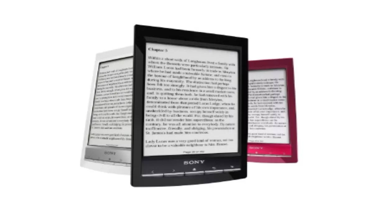
The modern, lightweight, slimline casing of the Sony eReader Wi-Fi Touch (PRS T1) gives is a funky 'cool kid' feel and look.
Like most eReaders it uses eInk and a glare free screen to simulate reading a traditional print book. You can turn the pages by either pressing a button below the screen or by swiping the screen as you would your touch screen smartphone. Connecting to Wi-Fi is no more difficult than setting up a Wi-Fi connection on your phone or a new laptop and according to the manufacturer the battery will go for up to a month, depending on whether Wi-Fi is on or off.
So far so good. I was looking to be wowed by this little reader because a) I like Sony products and b) it's just so aesthetically pleasing.
My first disappointment came when I plugged the eReader into my laptop. Rather than offering to install the necessary software and addons, I had to go through quite a rigmarole to get the two devices connected. I realise this might seem picky, or even lazy, but I am a big fan of making it easy for the user to use the technology. The easier it is to use, the more likely it is they'll use it.
When it came to actually using the device, things didn't really improve. The swipe screen is not as efficient as the screen of say an iPhone. Quite a bit of pressure is needed and although you can use the 'pinch and expand' method to make things bigger, the screen doesn't really like it. That said, you have the option of using the buttons beneath the screen; they have very little lag time and once you are in the habit of tapping them you are soon underway.
I found the screen font a nice size and easy to read and, as mentioned, the lag time when turning pages is minimal to nonexistent. My first Kobo had such a long lag I would have to hit the button a paragraph before I was ready to turn the page.
One thing that did make me happy was the support of not just eReader files but ePub files, Adobe PDF and TXT files. Combined with the drag and drop option, if you already have books or publications in these files you can simply add them without having to purchase a second time.
The reader comes with a stylus and in theory you can make handwritten notes on your reader. I found it really difficult to work and decided I wouldn't even use it for doodling, but I like the idea so I hope they perfect it going forward.
PROS
The lack of lag time and how nice the reader itself looks. Good format support.
CONS
Not the most intuitive of devices and it makes the experience a little more complicated than it needs to be.