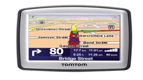
Review: TomTom One
Wed, 1st Jul 2009
FYI, this story is more than a year old
TomTom's ONE is its absolute entry-level GPS system, with a 3.5-inch touchscreen interface and Sensis WhereIS maps.
Pros: The ONE offers a very streamlined interface that makes basic navigation just that - basic. Maps are low on visual detail, but easy to read, and spoken instructions are clear and precise.
Cons: Initial lock-on was a little slow, and while TomTom might dub the ONE's screen mount 'EasyPort', we found it annoying compared to a regular suction-cup-with-clip arrangement. As you'd expect with a smaller screen, it's slightly tougher to read than a comparable 4.3-inch model.
Verdict: Good value for money with an odd screen mount system.