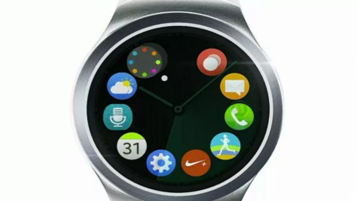
Samsung's soon-to-launch Gear S2 smartwatch
Wed, 19th Aug 2015Amidst the pile of hastily written hands-on "reviews" of Samsungs latest phablet line up, a crucial and tantalising piece of tech news went unnoticed as reviewers who'd barely spent any time at all with the Galaxy S6 Edge+ or Note 5 clambered to get their opinions published.
At the New York launch event, Samsung's Gear S smartwatch was also briefly teased in a rapid fire video. Samsung promised that more information will follow at an event in Berlin on September 3; here's what we know so far.
The OS
With the Gear S2, Samsung have ditched Android wear in favour of the more energy efficient and compact Tizen OS which they designed in-house.
The good news: This could translate into a battery life spanning several days rather than the 12-14 hours you get with Android wear.
The not so good news: The stable of apps for the Gear S could look pretty thin, especially when compared to what is available for Android wear and the Apple Watch.
The Display
The Gear S will also feature a round rather than a rectangular screen, giving the Gear S design parity with the Moto 360, LG Watch Urbane and the Huawei Watch. Many also argue that a round face gives a smart watch a significantly more traditional look.
The good news: The Gear S should look a lot more like a high end time piece, rather than a wrist mounted brick with a battery.
The not so good news: It's too early to tell how thick (or thin) the Gear S will be, and this could be a big factor figuring in its wearability.
Interface
The all too brief teaser clip provided some enticing insights into Samsung's interface design. The Gear S2's interface looked extremely clean and uncluttered (which is definitely a good thing when your screen is just over an inch in size). The flat look of the interface elements also helps keep things looking crisp and clean. While home screen looked a lot like the much hyped Apple Watch, it (unlike the iWatch) looks intuitive to navigate thanks to a wheel like arrangement where the user could run their finger around the edge of the screen to select a specific app. Not only did this look intuitive to use, but it could also have a huge bearing on the of the Gear S2's overall usability.
The good: Tidy, crisp and minimalist interface looks easy to navigate
The not so good: Will the Gear S remain touch screen driven , or will it incorporate a clunky crown mechanism. Too many apps could also see wheel of apps icons shrinking to the point of being unusable.
Apps and other bits
The teaser video also showcased a few apps running on the Gear S2. From these brief glimpses, it looks as if the gear S2 has a heart rate sensor and can display notifications such as messages and appointments. Interestingly one of the apps demonstrated looked a lot like the Nike+ app, which means Samsung could have already been working with 3rd party developers to ensure there are some apps in the stable when the gear S2 launches.
The good news: heart rate sensor and support for Nike+ is a good start
The not so good news: Can the Gear S2 and Teizen compete head on with the Apple Watch and the Android Wear app ecosystem? No sign of Samsung Pay?