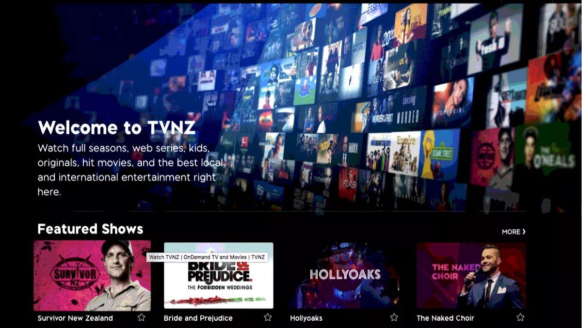
TVNZ ondemand's new look finding no love with viewers
TVNZ ondemand users haven't had much positive feedback for the desktop website's revamped look after trialling it over the weekend.
The biggest change on the desktop website is that Favourites and Watchlist features have been combined under a single tab.
Now, under the My Favourites tab, all the shows users have liked will be there with the most recently added episodes at the top.
TVNZ says it will be rolling out similar changes to its mobile apps soon.
So far, viewers using TVNZ ondemand haven't been ecstatic about the changes.
"I preferred to have all the new episodes from my Favourites together and choose which one to watch or remove, not arranged by series like now," viewer Loreta Hernandez tweeted.
Users also lamented the lack of show descriptions on the desktop version and the fact that the 'Remove From Queue" button was hard to locate.
Many complained that while the app's look had been updated, bugs that had plagued the old app still weren't fixed.
"@TVNZondemand upgraded but still haven't managed to fix it cutting back to the main screen after ads," Jenna Lloyd tweeted.
Android users said there were struggles with getting it on their devices, while Apple users complained that the app constantly crashed when they tried to use the AirPlay function.
"The team is currently looking into the AirPlay issues. We'll let you know as soon as we have a resolution," TVNZ tweeted in response to a user two days ago.
However, some users remained positive.
User @zaeokay tweeted: "I love the new look. Maybe it's a little faster?
One thing's for sure, TVNZ's ondemand experience (both desktop and mobile) needs to be improved a lot more before it can be taken seriously as a viable video-streaming service.

