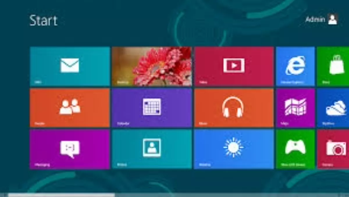
It seems Microsoft has finally realised that Metro isn't right for the desktop.
If rumors are true, it'll continue to remove the emphasis around Metro with the first major Windows 8.1 update due later this year.
Metro is a great user interface - although not on the desktop.
If you look at the positive side: On a tablet, Metro is very good. On a tablet device such as Surface, it's a more productive interface than Android or iOS. This is because you can have more than one app on the screen, something Microsoft has often emphasized in its ads, but something you can only appreciate when you switch from a Windows tablet to say an iPad.
It is hindered by the lack of must-have apps and it seems Microsoft hasn't figured out how to get the top apps onto Metro.
The best Metro apps are actually from Microsoft itself. Bing News, Microsoft's finance app, SkyDrive/OneDrive, Xbox Music, Bing Weather and Bing Maps.
Those apps highlight the potential of a platform that is different from its competitors. Microsoft has created a highly usable interface.
Metro uses some touch gestures that aren't always intuitive. why would you think to slide in from the left and slide back to open recently used apps? Or slide in from the right to bring up your settings? Once you get used to it works perfectly.
Instapaper founder Marco Arment argues Windows 8 - and Metro specifically - failed because “Microsoft isn't Apple, and Microsoft's customers aren't Apple's customers.” In his view, Microsoft's users weren't ready for a radical change and the company forgot who its customers are.
There's maybe some truth to that, it seems that Microsoft's main mistake was simply to force the old desktop and the new tile-based interface together into a single operating system.
Similar to Apple, Microsoft understands that a touch interface must be different from a regular desktop interface. However, instead of just building a Windows for tablets and a better Windows 7, it just stuffed it all into one package.
Windows RT was meant to be Windows for tablets, but even that contained a built-in desktop so people could run Office. and Windows RT has just confused people. If Microsoft had just allowed itself to let go of its compulsion to include Office with everything, there's a possibility Windows RT may have been successful.
Metro is a good interface, but it looks as though Microsoft was wrong when it thought people would quickly adopt to touch on their desktop and laptops. There is still time for that to happen, but at least for now, it would be doing the right thing for users by hiding as much of the Metro interface as possible.
