Windows 8 Consumer Preview impressions
Mon, 19th Mar 2012At the beginning of this month, Microsoft released the 'Consumer Preview' version of its new OS, Windows 8. It followed the release of the Developer Preview in September, and offered a chance for consumers - albeit tech-savvy ones - to have a play.
There's been a lot written about the preview since then, with the only consensus seeming to be that yes, this is as big a shift from Windows 7 as Microsoft has been preparing us for.
Part of the problem is that it's a beta release, and inevitably lacks polish. Another challenge is the fact it's designed to be used with both the touch interface of a tablet and the mouse/keyboard interface of a PC. That's never been done before, and will take a lot of getting used to.
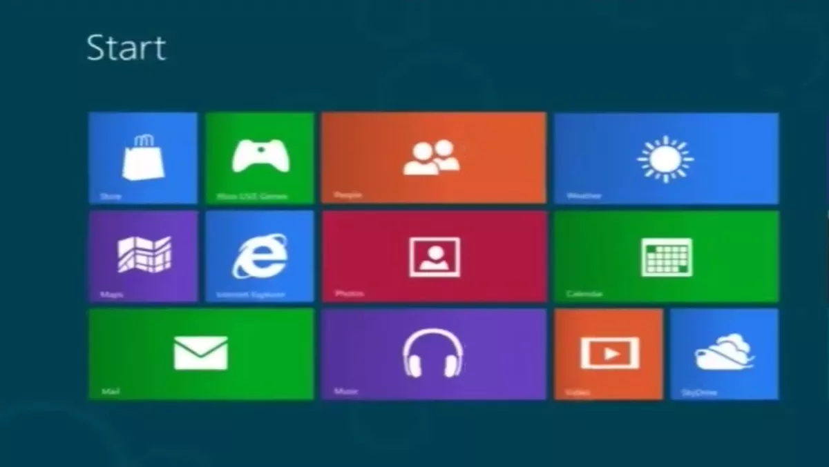
Personally, I found the preview to be pretty fun. I was using a mouse and keyboard, and it took me about 15 minutes to pick up the basics - opening and closing applications, pinning them to the start page, switching between them, and returning to the start page to start again.
Much has been made of the lack of a start button, and while it's obviously a big change, it doesn't take that much getting used to. The bottom left still returns you to the start page, or you can go to the right of the screen and bring up the 'charms', where you'll find a start icon among others like 'share' and 'search'.
To switch between apps, you go to the top left, which will bring up your last app; move down, and you'll see all your open apps. To close apps, you grab them at the top, and drag them to one of the bottom corners.
The preview also introduces Internet Explorer 10, which has in turn been radically redesigned. The navigation buttons and URL bar are at the bottom - which definitely takes some getting used to - and you navigate between pages by pressing Z and the Windows key to bring up the metro-style tab switcher (using touch, you just swipe from the top or bottom). There's a direct button for pinning websites to your start menu, so you can get to all your favourites straight away.
It's seriously early days, but I enjoyed exploring the new interface, and found myself keen to see what else I could discover. It doesn't feel natural, but that only shows what a huge change it is from the Windows we've known since Windows 95 and before. Will it satisfy both tablet and PC users? Hard to say. Will it satisfy both casual and power users? Even harder to say. Microsoft has plenty more to do, but from what I've seen they're heading in the right direction.
If you want more, there's a really good summary of the basics on Engadget, and for more detail and updates keep an eye on the Building Windows 8 blog.