Apple or Android? For richer, for poorer…
Fri, 21st Jun 2013While many people judge wealth on the clothes you wear, the company you keep and the technological gadgets you own, has it ever got as deep as what operating system you use?
In a new way of interpreting data, results of a Twitter heat map suggests iPhones signify affluence, while Androids aide the poor.
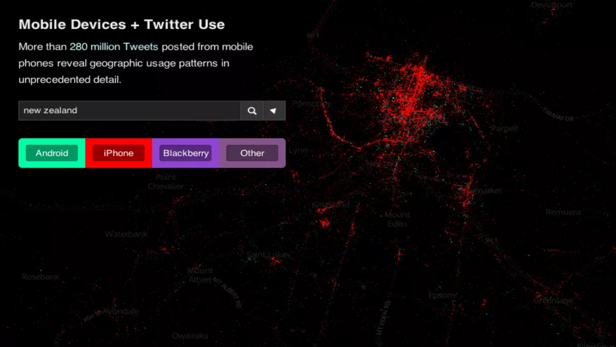
Unveiling the location of a quarter billion tweets across the globe, MapBox has depicted tweets according to operating systems - with iOS in red, Android in green and BlackBerry in purple.
Tweeted initially by Benedict Evans, the map suggests the red areas lit up in wealthier areas, as opposed to poorer regions of green.
A sea of red dominated the Auckland landscape on the map, suggesting a strong iPhone foothold within the city.
Yet does the love of iOS suggest wealth or poverty? Or simply a preference for the operating system in the business cities of the country?
Wellington, Hamilton, Taupo and Palmerston North followed the same trend, along with Christchurch and Dunedin in the South Island.
So New Zealand is an Apple loving nation it would seem - but does a preference for iOS over Android signify a bigger bank balance?
Across the world:
Attributed to across North America, MapBox said a similar pattern followed across Europe, with more affluent countries such as the UK, Central and Western Europe holding considerably more iPhone users than say Spain, which was dominated by Android.
Unsurprisingly Samsung's homeland South Korea is amass with green spots, while Japan and Hong Kong go red, along with major cities such as Shanghai, Taipei and even Seoul.
Does your operating system define your wealth? Is this report a load of bollocks? Tell us your thoughts below