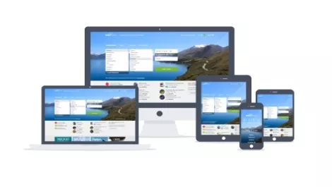
Wotif releases mobile responsive homepage on travel website

Leading online travel website Wotif has unveiled a new mobile responsive home page to its entire site traffic.
The new homepage, which has been in beta testing since late July, forms part of a wider responsive design project that aims to optimise the Wotif experience across PC, tablet and mobile.
Once complete, the company says the responsive design project will evolve the way travellers search and book their travel on Wotif by offering a seamless experience across all devices.
Wotif has spent the past 18 months continuously evolving its core technology to allow for more agile site enhancements across all platforms, following the announcement that technology was one of its five key strategic pillars.
The site enhancements that are currently live include enhanced promotion space, more inspirational imagery, the ability to alternate between exact date and flexible date searches seamless customer transition between accommodation and flights home page, and the ability to search using the Wotif country/region model or by keyword search.
Wotif says work will continue over the coming months to bring its iconic matrix into the responsive fold as well as introducing a mobile responsive booking flow.